Pantone

Timings, meetings, deadlines and red pencil markings combined with espresso and a lot of chocolate. In between of text drafts, DIY sketches, researches and a pool fool of Swarovski Crystals. Oh, and cupcakes. Or donuts, donuts are totally fine, too. Sometimes, when T is just minus five minutes, but you’d actually need at least fifteen, it’s getting hectic. Sometimes it just gets chaotic and sometimes it even is structured. We love our job. We love all that. Honestly. The thirty something post-its, all of them awaiting us even before the first cup of coffee with all of their different colours and the countless ideas on them, that will make up for a plan pretty soon. A plan we then will share with you.
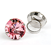
To keep the balance, to ensure a counter-pole for all the hectic. That’s what Pantone thought about, releasing the colours of 2016. Two delicate pastel shades in a warm, light rosé and a gentle and pale blue – Rose Quartz and Serenity.
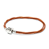
We love the trendy colours. And we will celebrate them later on with 16 degrees and raspberry and blueberry ice cream. And by the way: there are Swarovski Crystals in very similar colours.
You can find the nuance Serenity to be the Provence Lavender or as a matt Crystal Powder Blue. Combine those with the nuance of Rose Quartz, which you’ll find at our shop to be the Light Amethyst or as a matt Crystal Powder Rose.
Timings, Termine, Deadlines und Rotstift-Korrekturen kombiniert mit Espresso und ganz viel Schokolade. Dazwischen Textentwürfe, DIY Skizzen, Recherchen und unzählige Swarovski Kristalle. Oh, und Cupcakes. Oder Donuts, Donuts sind auch okay. Manchmal, wenn T nur noch minus fünf Minuten ist, man aber mindestens fünfzehn bräuchte, wird es hektisch. Manchmal auch einfach nur chaotisch und ganz manchmal sogar strukturiert. Wir lieben unseren Job. Wir lieben all das. Wirklich. Die 30 Post its, die in unterschiedlichen Farben noch vor dem ersten Kaffee mit To-Dos warten und die unzähligen Ideen, die irgendwann zu einem Plan werden. Und die wir dann mit euch teilen dürfen.
Die Balance halten. Den Gegenpol zur Hektik. Daran dachte Pantone, als sie die Farben des Jahres 2016 bekanntgaben. Zwei weiche Pastelltöne in einem warmen, hellen Rosé und einem sanften Hellblau – Rose Quartz und Serenity.
Wir lieben die Trendfarben. Und werden sie gleich nachher bei 16°C mit Himbeer- und Blaubeer-Ice Cream zelebrieren. Und psssst: Swarovski Kristalle gibt es in ganz ähnlichen Farben.
Den Farbton Serenity findet ihr bei uns als Provence Lavender oder matt als Crystal Powder Blue. Kombiniert mit dem Farbton Rose Quartz bei uns als Light Amethyst oder als matten Kristall Crystal Powder Rose.


Keine Kommentare: